

BoardTempo workshops · 5/8
Three landing-page makeovers: what happens after the Pin?
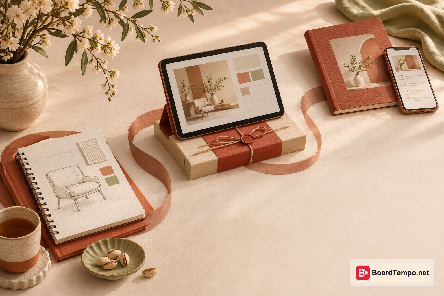
Your Pin has done its job: someone clicked. Now your website has to welcome them. Not with a grand introduction to your brand, and not with a sign-up form “just in case”, but with the thing they came for. Let’s make that practical by looking at three very different destinations.
These are fictional editorial examples, not client results or conversion guarantees. Open one of your own pages alongside this guide. The aim is to finish with a specific improvement brief, rather than another folder labelled “website inspiration” that nobody opens again.
1. The consultation page: explain the work before selling the dream
A Pin says, “How to arrange furniture in a narrow living room.” The link opens a designer’s portrait and the line “Creating spaces you’ll love”. Lovely sentiment. Unfortunately, the visitor is still wondering where to put the sofa.
If the Pin promises a tutorial, deliver the tutorial first: a circulation diagram, two layout examples and the limits of each. A consultation can be the next step after that useful answer. Renaming the button “Get your solution” won’t fix a missing explanation.
If the destination really is a service page, the Pin should say so: “A designer’s layout consultation for your narrow living room.” The opening screen can explain who it suits, what the client receives and what they need to prepare. For example: “We’ll review your room and discuss two furniture arrangements. Bring measurements and a few photographs.” Use this only if it accurately describes the service.
A button such as “See the format and price” sets a clear expectation. Further down, show duration, deliverables, pricing or the basis for a quotation, and relevant exclusions. A sketch is not a construction drawing. A decorating session is not a full architectural service. Specific boundaries make the offer easier to trust.
The initial enquiry form should ask for information that is actually necessary. You can collect project details later. Asking for an entire life story before someone can ask a question is an ambitious opening move.
2. The digital product page: make the invisible purchase visible
The Pin shows an attractive planner. Its product page repeats the picture and offers an “Order now” button. Is this a printed notebook, a PDF or an editable template? Does it arrive by post or email? The page looks polished, but the buyer is doing detective work.
Try an opening screen with the product name, “Printable PDF, digital download”, two readable sample pages and the actual price. Include the real dimensions, page count, language, required software and usage restrictions. Don’t invent specifications just to fill the layout.
Beside “Buy the PDF”, explain delivery. If the file arrives by email, say so. If buyers need an account with another service, tell them before checkout. Refund information should reflect the seller’s actual terms and applicable requirements; this is not a place for an improvised universal rule about digital products.
A useful preview shows the product itself. A laptop in a beautiful room may provide atmosphere, but it cannot tell someone whether the worksheet has the columns they need. Let readers inspect a sample and explain what is included in the paid version.
Licensing matters too. “Make anything you want” is a confusing invitation if commercial use is prohibited. Plain descriptions help people decide whether the product fits their project without having to decode the small print.
3. The Telegram guide: make the invitation feel like an invitation
A Pin offers “A window-light checklist for photographing pottery.” The landing page says, “Join our community”. Which community? Where is the checklist? What happens when someone taps the button? A genuinely useful gift can look questionable when the delivery route is a mystery.
Start with the guide’s cover and a brief preview: choosing a background, positioning the piece and adjusting the light. Then explain delivery. For example: “Open our Telegram bot and tap Start to receive the file.” If channel membership is required, disclose that beside the button, not after an unexpected eligibility check.
“Get the checklist in Telegram” is more informative than “Continue”. You may also need a note for visitors without the app: the link can ask them to open Telegram or sign in through its web version. Test those routes rather than promising that delivery will be seamless for everyone.
A bot, channel and discussion group are different things. One can deliver the file, another can publish updates, and another can host conversation. Following a link does not automatically mean joining a channel or agreeing to every future message. Make the choice understandable and voluntary.
Turn the review into a small, finishable job
Write four lines for your chosen page: the Pin’s promise, the visible evidence, the next action and the obstacle. An obstacle might be a broken form, but it could also be a price hidden several pages away.
Ask someone unfamiliar with the page: “What is offered? What would you receive? What happens after the button?” Avoid explaining it for them. If you need to narrate the entire experience, the page probably needs a clearer introduction.
Then test the real journey, including form submission or file delivery where appropriate. Use agreed test details so you don’t accidentally create an order or subscribe another person. A screenshot of a working-looking button is not proof of a working process.
Sources
Let’s talk about it
What could help your project? Share your experience or ask a question.
The discussion will appear here after this article is posted in our Telegram channel and comments are enabled. You can visit the channel meanwhile. Comments are public; you are not automatically subscribed.
Telegram loads only when you click. Telegram may ask you to log in to comment. If the discussion is not available, use the channel link above.