

Gimme Gummy and friends: playful Pins with a clear point
BoardTempo editorial · November 14, 2026
Some days you want to close the content spreadsheet and make a jelly-shaped button. Fair enough. Playful design can have a serious job: help the right person notice a useful idea. The trick is giving that person something clearer than “look, shiny!” Let’s build a Pin with personality and a reason to click.
This is part two of our Pinterest Predicts 2026 series. The official report includes Gimme Gummy, Glitchy Glam and Extra Celestial: tactile jelly-like effects, intentional asymmetry and otherworldly iridescence. The applications below are our own creative suggestions, not results from a campaign test.
Source for trend names and short descriptions: Pinterest Newsroom · Pinterest Predicts 2026. Forecast published December 9, 2025; article prepared November 14, 2026.
Gimme Gummy: touchable texture, readable message
Picture a rounded translucent accent, a soft highlight and a juicy colour beside a calm, ordinary headline. Instantly more inviting. Now resist the urge to turn every letter into jelly. Your reader came for an idea, not a decoding exercise in confectionery.
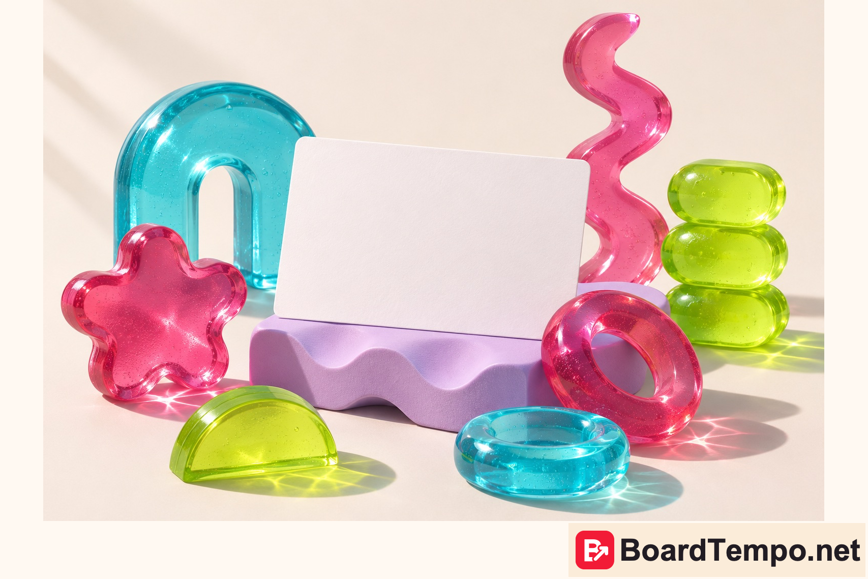
If you sell presentation templates, place one dimensional accent beside an actual slide preview. A headline such as “Add colour to your slides without creating a rainbow on every page” gives that visual a job. The destination should explain those techniques and show slide examples, not switch to an unrelated offer.
A baker needs a different treatment. Keep the real dessert front and centre. Our fictional jelly illustration could accompany a design-ideas article; it should not masquerade as a photograph of the cake a customer will receive. A concept image and a product photograph make different promises.
Glitchy Glam: break symmetry, not comprehension
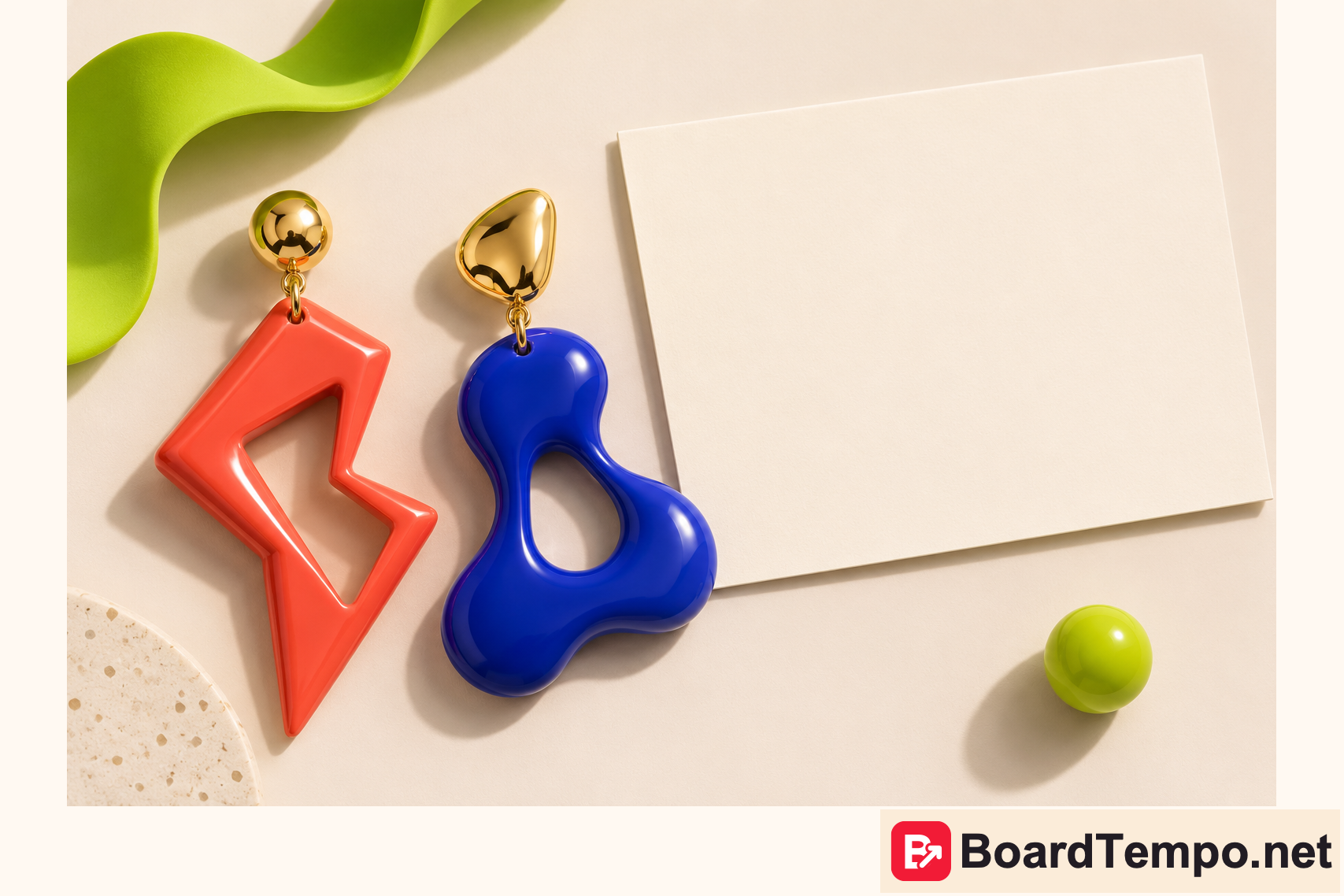
Try one small rebellion: mismatched accents, an offset frame or an unexpected colour pairing. Not all three at maximum volume. Keep the headline readable and the brand mark familiar. If everything demands attention, the viewer has to referee the composition before reading it.
A stylist could create a guide to mixing jewellery without looking accidental. One Pin explains the principle, another tackles a common mistake, and a third shows a combination for a specific occasion. Three useful entrances to one guide, rather than three rearrangements of “beautiful style ideas”.
Extra Celestial: a little space, no astronomical promises
Our interpretation is a single iridescent object on a quiet background. It could introduce an article about brand materials or a visual concept. For a technical tutorial, keep the important screenshot clear. The shimmer is supporting cast; it does not get to obscure the instructions.
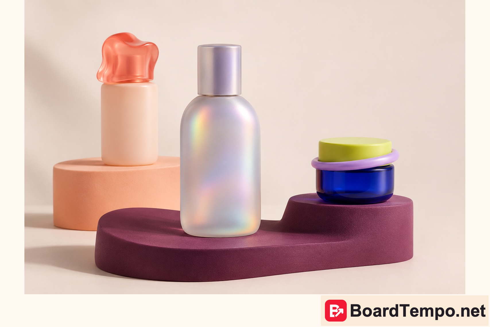
The packaging shown here is fictional concept work. It is not a cosmetics range, a review or a claim about a product. Naming that distinction is part of good creative communication: tell the reader what the image represents before asking them to imagine its possibilities.
Different Pin angles, not more of the same
For a guide to playful design, consider these angles: “One gummy accent for a clean cover”; “Make an asymmetric Pin easy to read”; “When one iridescent texture is enough”; “Three mistakes in colourful Pin design”; “Keep your brand recognisable while using trends”. Each headline needs a real answer on the destination page. If the answer is missing, improve the article before making the promise.
Not sure what to call your Pin? Start with a question a reader might ask: “How do I make a colourful cover without losing readable text?” or “How do I mix mismatched jewellery?” That gives people more to work with than “Trending design”. Give each image one clear job and answer its promise in the article. Check what people actually type into Pinterest separately: a catchy phrase is not proof of search demand.
Can all three directions share one design?
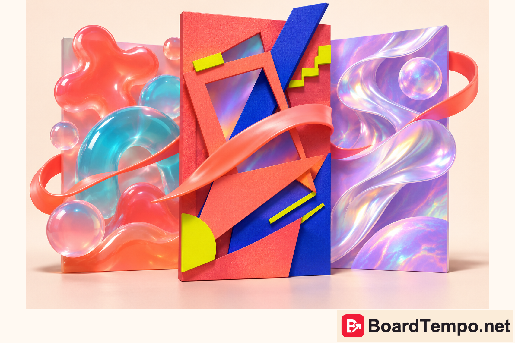
Yes, and the cover shows one way to make it work. Jelly forms, bold geometry and pearlescent shimmer each have their own panel, while a coral ribbon ties the composition together. The styles do not have to fight for every inch. Try the same approach for a collection: a shared background and one connecting colour, with a distinct personality for each card. Not every small button needs to host an entire galaxy.
Keep exploring
- Part one: six visual directions
- Beyond “handmade”: show the character of your work on Pinterest
- A Pin with a story: forest details, mist and a theatre curtain
For your project, start with the reader’s need rather than someone else’s image. How our Pinterest workflow works.

Let’s talk about it
What could help your project? Share your experience or ask a question.
The discussion will appear here after this article is posted in our Telegram channel and comments are enabled. You can visit the channel meanwhile. Comments are public; you are not automatically subscribed.
Telegram loads only when you click. Telegram may ask you to log in to comment. If the discussion is not available, use the channel link above.