

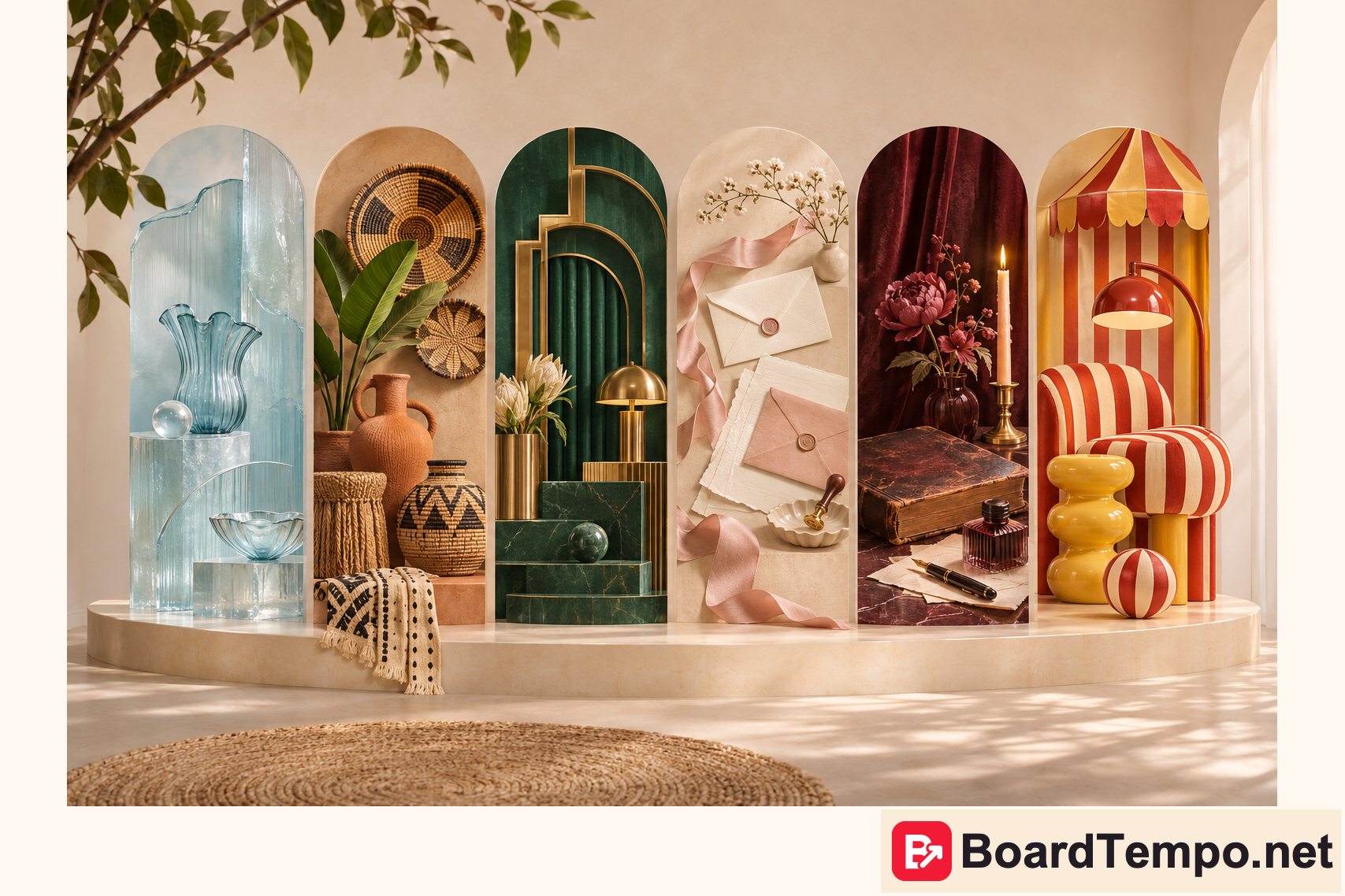
Pinterest Predicts 2026: six visual directions for purposeful Pins
BoardTempo editorial · November 14, 2026
Icy blue, warm ceramics, letters on lovely paper… Sometimes one detail makes you want to rebuild the whole mood board. No weekend rebrand required: let’s explore six directions from Pinterest Predicts 2026 and find ideas for your own Pins. Not a copy of someone else’s picture, but a fresh visual move of your own.
This is a practical look at the 2026 forecast, not an announcement for the next season. Pinterest published it on December 9, 2025, identifying 21 trends. The report uses internal Pinterest search data; it is not proof of sales for every business. We select several visual directions below. The suggested applications to Pins are our own editorial interpretation.
Pinterest Newsroom: Pinterest Predicts 2026
Choose the job before the style
Start with a reader’s question rather than a beautiful moodboard. What are they trying to choose, compare, make or avoid? A small-room guide and an analytics tutorial have different jobs. A visual trend is useful when it supports that job instead of disguising a missing answer.
Keep your logo, type hierarchy and composition principles consistent. For an individual series, change the background, texture, lighting or a single accent colour. This preserves recognition without turning your website into a collection of unrelated visual identities.
Cool Blue: a cool palette and a clear structure
Cool Blue centres on icy blue tones in the forecast. For editorial work, it suggests a calm palette worth trying, not a promise that a blue background will automatically generate more clicks.
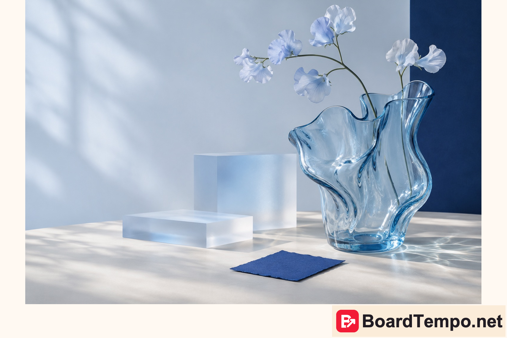
Our application pairs a pale background, dark headline and one translucent object. In a planning article it can create a visual pause between dense sections. In an instructional Pin, colour can separate the main point from secondary detail. Avoid thin white lettering on pale blue: an attractive design still needs to work on a phone.
A possible headline for a relevant article is “How to build a calm three-colour palette”. Do not force that headline onto unrelated content just to borrow the trend. First provide the corresponding answer on your website.
Afrohemian Decor: texture, not random ornament
Afrohemian Decor combines African and bohemian interior influences. Our original illustration explores indigo, wood, ceramics and weaving without presenting an invented object as an authentic artefact from a particular culture.
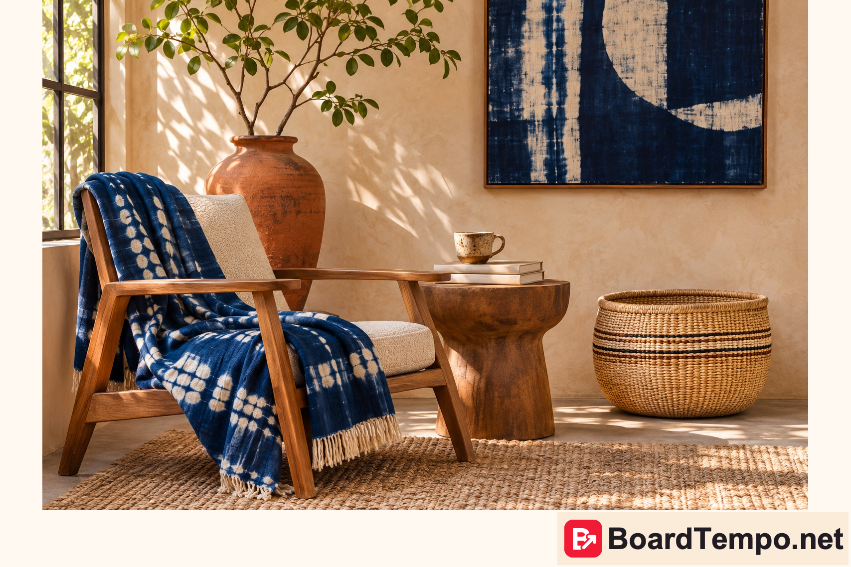
A close view of a texture can sit beside a plain area for a headline. This makes more sense for interiors, craft and materials than for an unrelated technology advert. If you feature a particular textile or maker, identify the origin accurately and check the photograph’s usage rights. “African style” is not a substitute for understanding distinct traditions.
A useful editorial angle might be “Combining indigo, timber and warm ceramics”. The article should explain those combinations rather than merely repeat a trend name. Commercial products need truthful product imagery, not an invented image presented as a photograph of the item for sale.
Neo Deco: geometry that supports reading
Neo Deco revisits Art Deco geometry in a contemporary form. Our practical choice is one expressive silhouette with ample space, rather than an ornamental border around every paragraph.
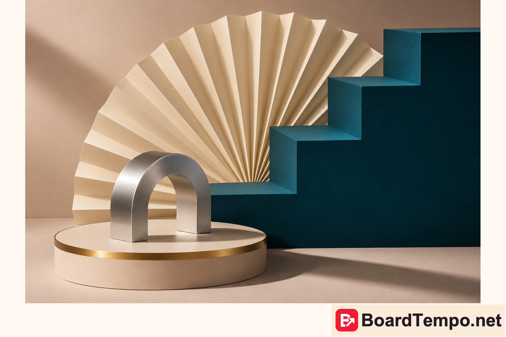
A stepped composition can support a cover for a sequence of steps. An arch can frame a subject; repeated lines can connect a series. Charts, however, must represent real information: decorative bars should never masquerade as performance data. Choose a straightforward, readable headline typeface even when the illustration is elaborate.
Pen Pals: a letter you want to open
Pen Pals explores letters and correspondence, while Poetcore draws on a writerly aesthetic. Our interest is not in dressing a character but in suggesting thoughtful work through paper, margins, notes and an unhurried composition.
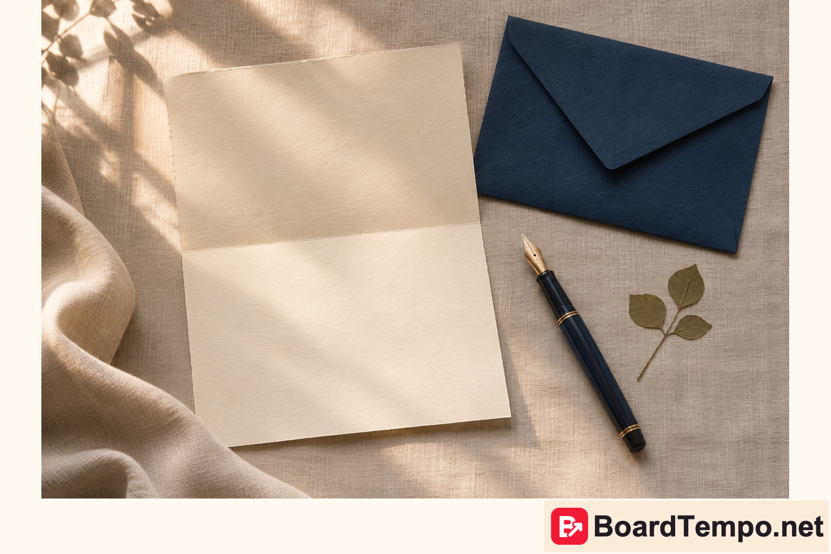
This can suit a checklist, workbook, set of questions or editorial notebook. A paper photograph should not replace substance: show one useful point or clearly explain what the reader will find after clicking. Do not fabricate a handwritten testimonial or disguise invented results as a real client’s notes.
Poetcore: give your idea a writing desk
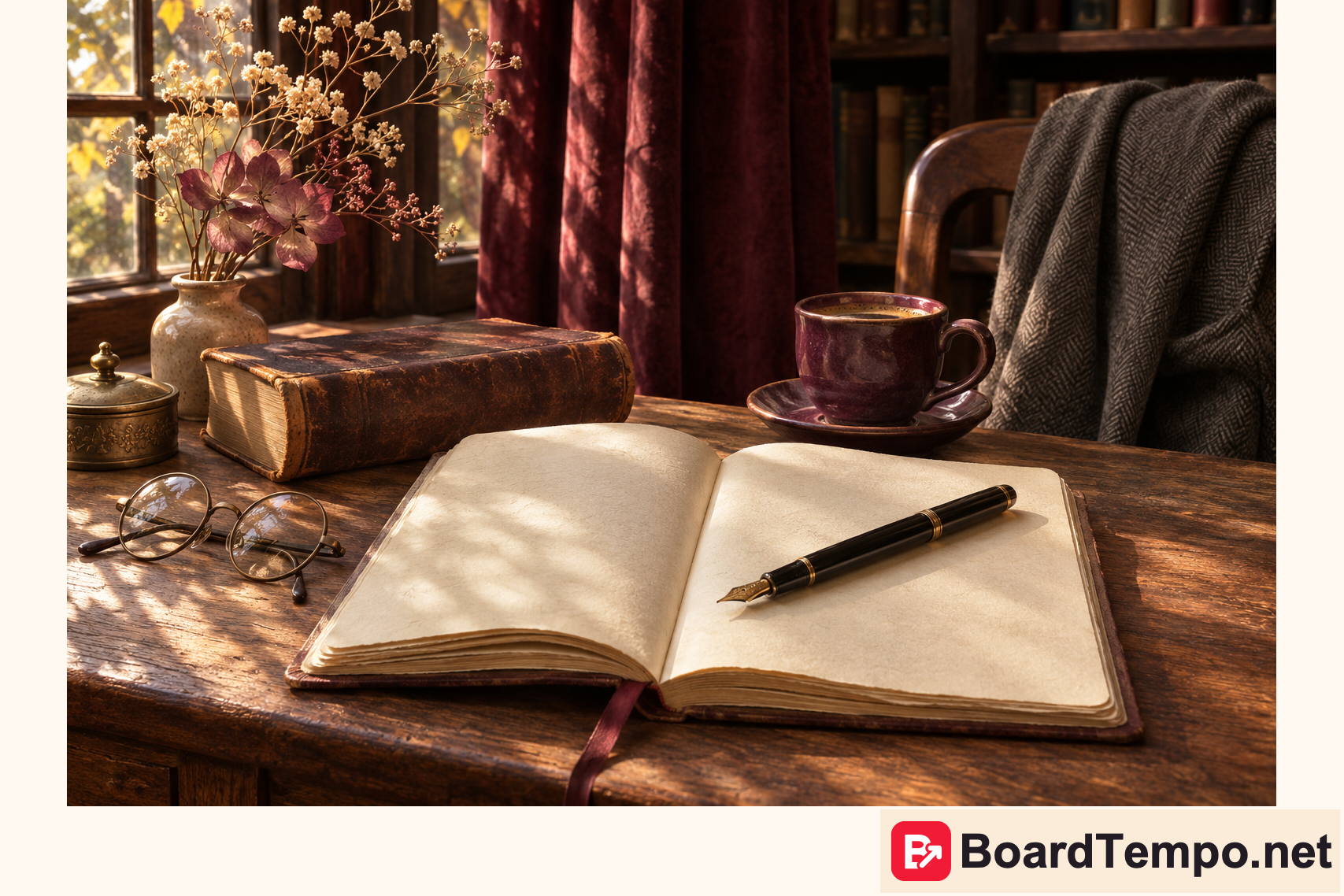
Where Pen Pals invites you to write to a friend, Poetcore gives you a quiet moment with a notebook. Think warm light, an open journal and a pencil mark. Our editorial interpretation borrows that thoughtful mood for an ideas journal or a collection of writing exercises. Show the exercise in the article, not just the lovely desk. Inspiration enjoys a cosy room; readers also need a reason to stay.
FunHaus: personality without visual noise
FunHaus brings circus-inspired motifs into interiors. We borrow playful scale and stripes while keeping the composition restrained.
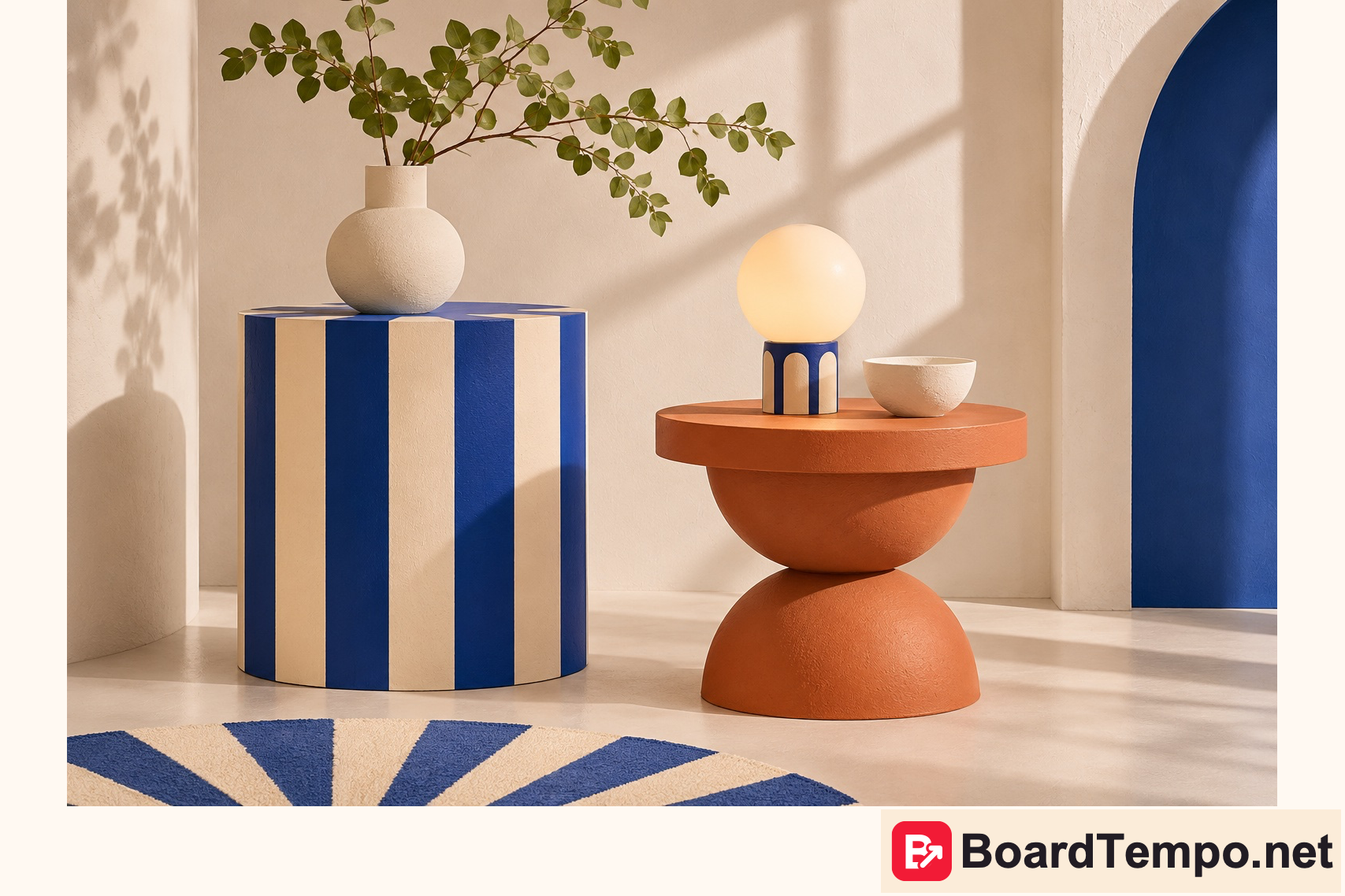
One striped object can anchor a series. Several competing patterns, a loud headline and three calls to action make the message harder to understand. View the cover at a small size. If you cannot quickly identify the topic, remove something. Brightness cannot repair an unclear idea.
How to test a direction on your own project
Choose an existing useful article. Write down its specific promise, then prepare two Pin versions with the same meaning: one in your familiar brand style and one with a single trend-inspired element. Keep the headline, destination and publishing conditions comparable. Changing everything at once makes interpretation difficult.
Decide in advance whether you are evaluating saves, outbound clicks or actions on your website. These are different outcomes. Record the observation period and differences in distribution. Do not choose a winner from a handful of impressions or attribute a difference to colour alone without enough evidence.
For BoardTempo, trends inform individual editorial experiments rather than a wholesale redesign of older articles. We retain our overall style and explore new textures and compositions in new material. These illustrations demonstrate a possible direction; they are not results from a completed performance test.
Read the source with its limits in mind
Pinterest Predicts is a forecast based on search signals. Its methodology describes global English-language searches from September 2023 to August 2025, with year-on-year comparisons of September 2024–August 2025 against September 2023–August 2024. It is not a ready-made keyword strategy for a Russian-language project. Topic, language and audience still require separate research.
Every illustration here was created specifically for BoardTempo using AI. None was copied from the report, and none is an official Pinterest image. The direction names come from the original forecast; the design examples and practical recommendations are our editorial interpretation.
Pinterest Predicts 2026: official report and methodology
Keep exploring
The next chapters change the mood: from jelly-like shine to handmade detail and a little theatre. Choose the direction that feels right for your project.

Let’s talk about it
What could help your project? Share your experience or ask a question.
The discussion will appear here after this article is posted in our Telegram channel and comments are enabled. You can visit the channel meanwhile. Comments are public; you are not automatically subscribed.
Telegram loads only when you click. Telegram may ask you to log in to comment. If the discussion is not available, use the channel link above.