

Pin templates: faster doesn't have to mean identical
The first Pin took half the evening. For the second, you reused the layout that worked. By the tenth, you're struggling to tell it apart from the first.
A template saves you from choosing a font every time. It can't choose the topic, photograph or point of the Pin for you. Let's give it the routine work and keep the interesting decisions for ourselves.
Decide what stays consistent
Choose a main typeface, a couple of colours, a place for a small logo and sensible margins. For a standard image Pin, you can start with Pinterest's recommended 2:3 ratio, such as 1000 × 1500 pixels.
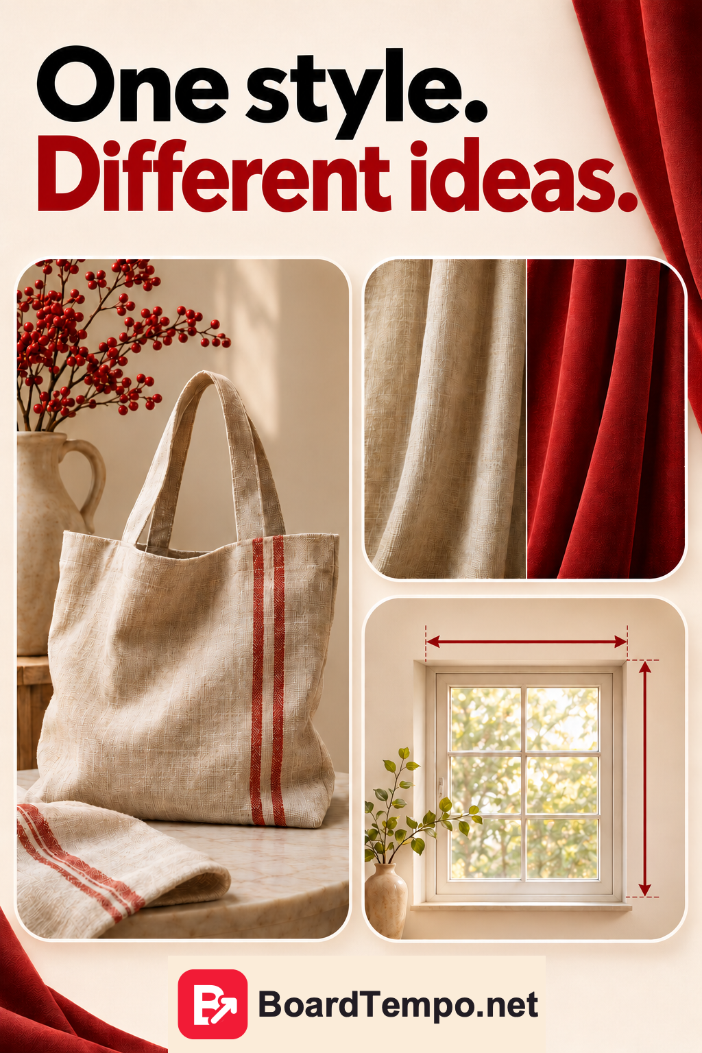
At BoardTempo, that means recognizable red accents, a light background and a visible but modest brand mark. The logo helps readers recognize the source; it shouldn't compete with the headline.
Check the words on a phone. Small type can look perfectly respectable on a big monitor. In the feed, it's another story.
Make three layouts for different jobs
First: show the work. A large photograph, a short headline and the brand name. This could suit a finished bag or curtains shown in a room.
Second: compare. Two photographs with clear labels, such as the same fabric in daylight and under a lamp. Keep the conditions otherwise comparable so viewers can understand the difference.
Third: explain. A few steps or a simple diagram. For example, which measurements to take before ordering curtains. Keep the detail in the article and show the essentials in the image.
Shared colours and typography tie these together without forcing every topic into the same layout.
What should change in each Pin?
Start with the question it answers. “Which curtains work beside a desk?” is not the same as “How do I measure the window?” They need different images and headlines.
Changing only the border colour gives someone very little new reason to open the article. Show another detail, answer another question or choose a different example instead.
Check the destination too. A Pin about measurements should lead to instructions on measuring. Don't send it to a general catalogue and hope the reader works out the rest.
Build one small test set
Take three different topics and try them in your design system. If a headline doesn't fit, tighten the wording rather than shrinking the letters to footnote size.
If a diagram feels cramped, don't add another five boxes. You may be trying to explain two topics at once.
Put the three designs side by side, then view each on its own. Together, they should look like one creator's work. Separately, each should explain one particular idea.
Being recognizable doesn't require thirty identical twins. It's enough for someone to see the next Pin and think, “Oh, they're the ones who explained curtains properly.”
A quick check before saving
Read the headline without enlarging the image. Check that the photo actually answers it. Make sure the logo doesn't cover an important detail. Open the link.
If the layouts are ready but you've run out of topics, read “One article, several Pins.” We look for different reasons to visit, not different shades for the same border.
Source
Let’s talk about it
What could help your project? Share your experience or ask a question.
The discussion will appear here after this article is posted in our Telegram channel and comments are enabled. You can visit the channel meanwhile. Comments are public; you are not automatically subscribed.
Telegram loads only when you click. Telegram may ask you to log in to comment. If the discussion is not available, use the channel link above.